
Keep JB4 cPanel interface for JB5
Completed
Suggestion to keep old cPanel interface as an option. Its more simple and more clear from user's prospective, in order to restore, there are more steps to take, some customers unable to figure how to start restores.
Would be nice if we can decide which cPanel interface to keep, legacy or new "admin" style.
 I like this idea
Hello Everyone,
Thank you for your continued patience!
We are excited to announce the release of JetBackup v5.2.0 on the EDGE Tier! This release includes our revamped End-User Panel. Thanks to your support and feedback, our developers have made many changes to the End-User Panel to make it more "Simple" and "Clear to use". Here is a preview of the new User Dashboard!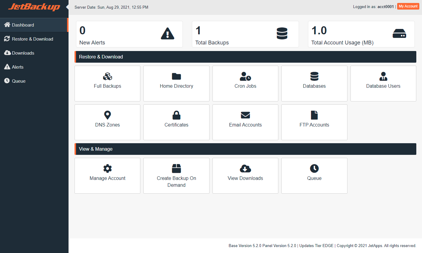
Please feel free to take a look at our End-User Panel Documentation for an overview of all the features and changes. If you have any questions regarding this feature, please reach out to our support team at support@jetapps.com or leave your feedback on our forum post at https://forum.jetbackup.com/viewtopic.php?f=12&t=420. We look forward to seeing your feedback!
Thank you,
The JetApps Team
Hello Max,
Thank you for leaving your feedback and opening a feature request. We will be reviewing your request and provide updates accordingly. Please note that we utilize the voting system to gauge demand for new features. The more votes a request has, the more likely it will be up for consideration by our developers.
Thank you,
Richard, JetApps Team
I think the OP is right. The new interface is not as user-friendly as the previous. Would be great to have a simplier interface similiar to the one JB4 has now.
I think the OP is right. The new interface is not as user-friendly as the previous. Would be great to have a simplier interface similiar to the one JB4 has now.
+1 For this post. The Old end-user interface is more clear and easy to understand. Let us decide which style to use.
+1 For this post. The Old end-user interface is more clear and easy to understand. Let us decide which style to use.
Hello everyone,
Thank you for your continued support of JetBackup 5 and for providing us with your feedback regarding the end-user interface. Our developers are hard at work with refreshing the UI to allow for better accessibility and we would like to take this opportunity to ask for your specific suggestions regarding the features you would like to see in the end-user interface. What are your expectations of certain buttons, what should be removed, what should be accessible when given permissions, etc..?
Your feedback and suggestions allow us to continually deliver secure, reliable, and versatile products. We look forward to seeing your suggestions.
Thank you,
The JetApps Team
You need only to refresh the old one, is more intuitive for and user, if you add a graphic calendar will be a great idea too.
You need only to refresh the old one, is more intuitive for and user, if you add a graphic calendar will be a great idea too.
Specific things that I'd recommend changing in the UI are;
1. Permissions and UI
If I remove a permission in WHM, then the cPanel user should no longer be able to see the icon/section in their interface. For example, in WHM, if I remove the permission for users to 'Can Manage FTP Account Backups', then they should not even see the 'FTP Backups' tab in their interface (leaving it there just causes confusion).
2. Naming and words used to describe things
The naming used in Jetbackups 4 was more user friendly for the average user. The avg customer understands 'File Backups'. Calling it 'Home Dir' is confusing for the avg customer who is not technical. I understand the benefit of consolidating the UI into a single area so that it can be shared across platforms but I think within that single area, you can utilise some of the UI user experiences you had in Jetbackups 4 so that the user experience is consistent for customers who are upgrading. Besides being consistent, it sounds like the experience was generally better/easier to navigate/understand.
The phrasing of 'Generate Download' from version 4 is more user friendly than the wording 'Download' in version 5 (which implies if I click on this, I'll be able to download something). Having never used Jetbackup before verison 5 (only seeing Youtube video tutorials) I actually got confused when clicking download and it took me several minutes that clicking download actually generated a download and that I needed to navigate to a separate section in order to actually download the files. When looking at the Youtube videos of version 4, the application appears a lot more user friendly and easy to use/follow.
3. Less sub-menus/drop downs. More info on page
Again from a UI perspective, if a customer wants to restore or download some files from a backup, the first thing they're going to want to do is select the type of file they're wanting to restore/download. So for example, the customer is going to click on 'DB Backups', 'Email Backups' or 'File Backups'. Once they click on one of these icons, rather than be shown a very small menu item and have to select from a drop down
Seeing a list of the available backups and having the option to 'restore' or 'generate download' is a better user experience. From the below older interface, I can see my full list of Email, website, database backups. It's a lot easier to read and understand.
Having to select the correct backup from a drop down menu, just so that the 'change files selection' button will appear on the screen. Then click on the 'Change files selection' button in order to open up a pop up window results in more clicks and confusion when compared to...
Being shown a full screen of all my backups and having a 'File Manager' button to the right. This older option is easier to understand and use for the average user. Upon seeing the screenshot of the page, I immediately understood what I was looking at where as when having to navigate through the new interface, I got very confused trying to find the files I was trying to find the backup and files I was wanting to restore from.
The backup overview is much easier and clearer for customers in version 4.
In version 5, the customer has to laboriously select the time with the drop-down. And the functions such as file, email and database backups are only displayed when the Advanced button is clicked.
In version 4, the customer saw everything immediately in a table and only needed 1 mouse click for the desired restore. In version 5 this is much more complicated.
In the meantime we have received complaints from 279 end customers about the complicated operation of the new version 5!
The workload in support was previously 1 to 2 emails and 2 to 3 calls a month about backup. Since we switched to the new JetBackup version 5, we have received 374 emails and 87 calls in just 2 weeks on the subject of backups. The customers do not get along with the service. It's anything but simple and intuitive.
That was much better in version 4. If something does not improve as quickly as possible, we will have to switch back to version 4. Version 5 is currently not yet acceptable for us.
I agree the cpanel end-user interface for JetBackup 5 is not good.
We often have customers who contact our support because they are not able to understand how to get the restore they want. The current interface is confusing and not at all useful for non-technical customers.
My preference is to have a SIMPLE "restore wizard" for the customer.
1. When would you like to restore from? This would show a graphic calendar with available backup dates and times shown in the boxes. (Like how cpanel backup does it with their restore page where you can pick a backup to restore by date.) If it's too difficult to do a graphic calendar, then show a simple listing of available backups. Columns could include backup date, type, location.
2. After restore date is selected, then ask what they want to restore. NOTHING should be selected by default. Here you display "FULL ACCOUNT RESTORE", and then also the various backup items for the selected restore date. Specific files only, DNS, SSL certs, Email Accounts, etc..
3. If they select Full Account restore, then all done. If they select specific files, then walk them through selection of the file(s) they want. Same for email accounts, etc..
Please also explain in more detail the difference between a restore and a download. Many customers don't understand that.
Lastly, please auto-redirect the customer to the queue page after their restore/download request has been submitted to the server. Many customers do not understand that it could take some time to wait, especially if they selected a large amount of data to restore. So we often get a support ticket.. "WHERE IS MY RESTORE?!!!".. when all they need to do is wait. So showing them a simple "please wait while the server works to restore your data, and perhaps a queue position (if we have specified to limit the restore processes to nly one process at a time to not kill our servers..)
Thanks.
I totally agree. When a customer wants to do a single file restore they are messing up the restore. They are restoring the databases, email accounts, dns zones if they do not click on remove items on items they don't want restored. Why does a customer have to remove items when all they want to do is restore one file. What a disaster. We are having to email our clients on this before they mess up their site. Most clients are now asking us to do the restore, its too complex.
I totally agree. When a customer wants to do a single file restore they are messing up the restore. They are restoring the databases, email accounts, dns zones if they do not click on remove items on items they don't want restored. Why does a customer have to remove items when all they want to do is restore one file. What a disaster. We are having to email our clients on this before they mess up their site. Most clients are now asking us to do the restore, its too complex.
Hello Everyone,
Thank you for your continued patience!
We are excited to announce the release of JetBackup v5.2.0 on the EDGE Tier! This release includes our revamped End-User Panel. Thanks to your support and feedback, our developers have made many changes to the End-User Panel to make it more "Simple" and "Clear to use". Here is a preview of the new User Dashboard!
Please feel free to take a look at our End-User Panel Documentation for an overview of all the features and changes. If you have any questions regarding this feature, please reach out to our support team at support@jetapps.com or leave your feedback on our forum post at https://forum.jetbackup.com/viewtopic.php?f=12&t=420. We look forward to seeing your feedback!
Thank you,
The JetApps Team
Replies have been locked on this page!